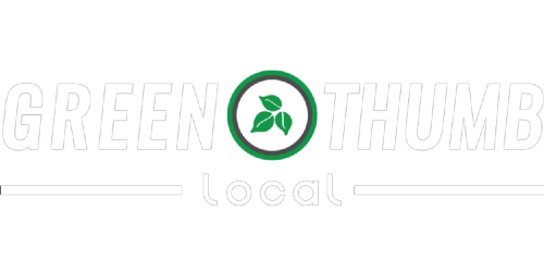
THE BENEFITS AND MISHAPS OF SMALL BUSINESS LOGO DESIGN
A logo tells a story: it tells your story, what you offer, what you want to be represented by, who you want to appeal to as your customer, and a whole lot more. This is why choosing the right logo to show the purpose of your business is key to branding your local, home-service business successfully. Here are the critical components of a solid business logo and some common small business owner mistakes to avoid.
It conveys your service offerings
Say you have a budding plumbing business or have worked as an electrician for 35 years; either way, you'll need to justify that leaf by providing eco-solutions or natural services. The symbol in your logo needs to align with what you offer. Try to stay away from anything too specific or that can drive away certain customers if it's not super important to the brand.
For example, don't put an oozing bug in the middle of your pest control logo. It's too obvious and, sorry to say it, off-putting. Everyone knows that pest control companies "get rid" of bugs and other critters, we don't need to see a dead bug body in the middle of your company's first impression.
Typography is important
Choosing the right font for your business plays a role in how people feel about you before they decide to look further. Is your font too whimsical, and you provide emergency home services? You may not think it, but someone might not pick up the phone if they're worried about their plumber taking their job seriously.
Serif fonts are more professional and traditional. They have a line at the end of each letter stroke.
Sans serif fonts are more crisp and modern even. They don't have a line after each stroke.
Display fonts are usually used for text-only logos. They are unique and varied in style.
Italic or Script fonts are formal and decorative and often are associated with more feminine brands and occasions.
Handwritten fonts are personal and friendly. They have a casual and approachable feel to them.
If you use one type of font, stick with it. Sans serif sticks with sans serif, jumping across the board gets messy and makes the logo look unpolished. You got this!
Colors have meaning
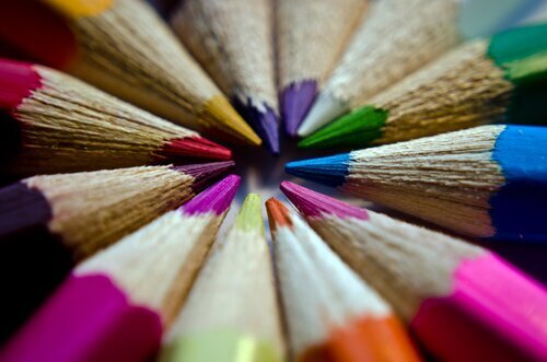
There is no need to get carried away when it comes to colors. The best performing global brands use one or two colors in their logos. Since we're appeasing the local crowds, go ahead and use a couple or a few, but remember that colors have meaning behind them in design. We won't bore you with all of the color details here, but red usually signifies power, strength, passion, and blue is most associated with dependable, honest, and trustworthy businesses. Yellow is cheery, happy, and friendly. Green shows signs of growth, wealth, and balance. The list continues.
Before committing to a design, think about your core business values and what colors most closely align, and then use those colors throughout the rest of your business branding for cohesive and straightforward brand recognition.
An unprofessional logo can hurt your business
This should go without saying, but a messy logo portrays that a business is messy. Don't get caught up in slapping something together and deal with the misfortune of lost customers. Clean, professional designs lend to better first and longer-lasting impressions.
It grabs attention
Generic logos are the worst. People don't want to call a business that scraped together a logo in five seconds in some free online logo maker tool. You may be able to stand behind your business and service offerings, but bad logos can cause someone to move on to your competitor, especially if used in conjunction with a bad or limited web presence.
There's a reason corporations spend loads of money on logos and branding. Though, unlike the behemoth corporations, local, home-service businesses don't have the luxury of spending millions on logo design and pumping people full of their brand recognition until the picture sticks.
Most importantly, limited funds doesn't mean your branding has to be boring. Try focusing on what your business stands for and find a way to incorporate that into a unique and exciting graphic that represents your business. Get a few opinions internally and externally from your company to see if your employees and customers feel that it fits. If ever in doubt, consult with a professional. Happy logo-designing!
Green Thumb Local creates powerful online advertising and brand management for your local business. If you want a fully customized web presence without the hassle, call 480-360-0101 today!